If you are an Android application developer. Then you definitely know about Collapsing Toolbar. It is a wrapper for Toolbar which implements a collapsing app bar. Flutter team calling it Sliver App bar. It displays an image or background in the upper part of the screen, occupying a fixed space, so that later, by scrolling upwards, the content changes and becomes a navigation bar in iOS or toolbar in the case of Android.
In Flutter, Sliver App bar is designed to be used as a direct child of an App Bar. This type of widget is commonly seen in the User Profile Screen. You can check it with Whatsapp user profile screen.
Let's have look on Sliver App Bar properties in the following diagram that flutter providing us.

You can create simple Appbar having a leading, title and menus like this:
This is the output from the above code.

As you can see above, if we need a simple app bar. You can create it just simply add the widgets in the app bar by providing param. But if you want some scrolling effect and other animation on App bar widgets. Then you have to use the Sliver App Bar.
In this post, we going to create a Flutter application that'll show all the use case of Sliver App Bar. In this app, we'll use the sliver app bar to display a background image and a user profile pic widget in the circular shape. The final output of the app looks like below.
Creating a new Project
1. Create a new project from File ⇒ New Flutter Project with your development IDE.
2. Open main.dart file and edit it. As we have set our theme and change debug banner property of Application.
as you can see above, we have used routes parameter for declaring all screen of the app. We'll use the first screen for just scaling user profile icon on the same place and add some tabs. In the second screen, we'll scale and translate user profile icon and use list view.
3. Now create a state full widget that is the first screen of the app and give name collapsing_tab.dart. Here, starting edit build method. Use body param and add DefaultTabController as a root of screen widget. It will control the tab bar movement after sliver app bar change. As you can see below, we have created a flexible space bar widget.
in the above code snippet, we have created another method _buildAction(). It'll show user profile pic in the circular shape in the right side fo App Bar.
in this method, we calculate a scaling state of user profile pic icon and create a new widget. The output of the above code snippet looks like below.


4. After that let's add tab bar in the bottom of the sliver app bar. For add tab bar, we have used delegate param of sliver header. To manage tab content, we have created another class _SliverAppBarDelegate. It will create tab bar scroll animation proper way as we want. In the following code snippet, you can see complete collapsing_tab.dart that we use in the app. If you facing any issue to implement tab bar. You can read it here. We have discussed it in detail.
the output of the first screen.
 After scroll upward
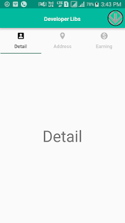
5. Now, it time to create the second screen of app that'll show another use case of sliver app bar. So create collapsing_profile.dart state full widget. It will open when you will tab user profile icon on that we have added in the first screen. For manage translate animation of the user profile pic, we have created a utility class sliver_fab.dart.
as you can see above, in this class we calculating a widget position after scrolling the sliver app bar.
6. After that, open collapsing_profile.dart file and start editing build method as below we did. In this method, we using floatingActionButton for display user profile pic in the circular shape. We have set height 256.0 of the flexible space and in the slivers param. We have added a background image and SliverList widgets. Here, you can see a complete file of second screen.
So, that's all about Sliver App Bar. Run app and see the magic,
If you have followed the article carefully, you can see the app running very smoothly as shown in the above video demo. But if you are facing any problem.


You can get the working project from Github and please feel free to ask in the comment section below.
In Flutter, Sliver App bar is designed to be used as a direct child of an App Bar. This type of widget is commonly seen in the User Profile Screen. You can check it with Whatsapp user profile screen.
Let's have look on Sliver App Bar properties in the following diagram that flutter providing us.

- leading: A widget to display before the title. This is the widget where usually a hamburger icon or back button is displayed.
- title: Toolbar title goes here wrapped in a Text widget.
- actions: It is the right side of App Bar. Here, you can declare other option of apps like search, setting and profile etc.
- bottom: The bottom is usually used for a TabBar below the Appbar.
- flexibleSpace: This widget is used to create a Collapsing Toolbar effect with Appbar.
You can create simple Appbar having a leading, title and menus like this:

As you can see above, if we need a simple app bar. You can create it just simply add the widgets in the app bar by providing param. But if you want some scrolling effect and other animation on App bar widgets. Then you have to use the Sliver App Bar.
In this post, we going to create a Flutter application that'll show all the use case of Sliver App Bar. In this app, we'll use the sliver app bar to display a background image and a user profile pic widget in the circular shape. The final output of the app looks like below.
Creating a new Project
1. Create a new project from File ⇒ New Flutter Project with your development IDE.
2. Open main.dart file and edit it. As we have set our theme and change debug banner property of Application.
3. Now create a state full widget that is the first screen of the app and give name collapsing_tab.dart. Here, starting edit build method. Use body param and add DefaultTabController as a root of screen widget. It will control the tab bar movement after sliver app bar change. As you can see below, we have created a flexible space bar widget.

After scroll upward, user profile pic will be visible

4. After that let's add tab bar in the bottom of the sliver app bar. For add tab bar, we have used delegate param of sliver header. To manage tab content, we have created another class _SliverAppBarDelegate. It will create tab bar scroll animation proper way as we want. In the following code snippet, you can see complete collapsing_tab.dart that we use in the app. If you facing any issue to implement tab bar. You can read it here. We have discussed it in detail.


5. Now, it time to create the second screen of app that'll show another use case of sliver app bar. So create collapsing_profile.dart state full widget. It will open when you will tab user profile icon on that we have added in the first screen. For manage translate animation of the user profile pic, we have created a utility class sliver_fab.dart.
6. After that, open collapsing_profile.dart file and start editing build method as below we did. In this method, we using floatingActionButton for display user profile pic in the circular shape. We have set height 256.0 of the flexible space and in the slivers param. We have added a background image and SliverList widgets. Here, you can see a complete file of second screen.
So, that's all about Sliver App Bar. Run app and see the magic,
If you have followed the article carefully, you can see the app running very smoothly as shown in the above video demo. But if you are facing any problem.
You can get the working project from Github and please feel free to ask in the comment section below.


