The dropdown is a toggleable menu that shows all the available option when we click on it to choose one option from predefined options.
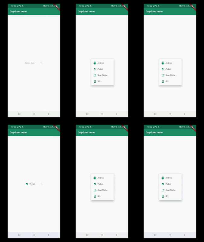
In Flutter, the dropdownbutton is a widget that we can use to select one value from a set of values. In the default state, a dropdownbutton shows its currently selected value. After clicking on the dropdownbutton it displays a drop-down menu with all other available values, from which the user can select a new one.
In this post, we will give you hands-on experience with Flutter dropdownbutton as a drop-down menu. We will create a Flutter application that consists of a simple dropdownbutton that allows selecting an item from a drop-down list. We'll display static data in the dropdownbutton and make a demo like below:
To use the dropdownbutton widget, we have to use properties: items and onChanged.
now, let's start a demo to display a list of items in the dropdownbutton widget with the help of following steps.
Creating a new Project
1. Create a new project from File ⇒ New Flutter Project with your development IDE.
2. After that open main.dart file and edit it. As we have set our theme and change debug banner property of Application.
4. Here, you can see complete code snippet of above-shown demo of dropdown option.
If you have followed the article carefully, you can see the app running very smoothly as shown in the above. But if you are facing any problem or you have any quires, please feel free to ask it from the comment section.
In Flutter, the dropdownbutton is a widget that we can use to select one value from a set of values. In the default state, a dropdownbutton shows its currently selected value. After clicking on the dropdownbutton it displays a drop-down menu with all other available values, from which the user can select a new one.
In this post, we will give you hands-on experience with Flutter dropdownbutton as a drop-down menu. We will create a Flutter application that consists of a simple dropdownbutton that allows selecting an item from a drop-down list. We'll display static data in the dropdownbutton and make a demo like below:
To use the dropdownbutton widget, we have to use properties: items and onChanged.
- items is of type List<DropdownMenuItem<T>>, where T is the value type. It can be a number, String or any other type. For each DropdownMenuItem, you need to define value and child. The value must be of type T which means it must be the same across all options. For example, if you construct with DropdownButton<String>, the value of all options must be String.
- onChanged is a function with one parameter. When you select an option, it will be called with the new value as the argument.
now, let's start a demo to display a list of items in the dropdownbutton widget with the help of following steps.
Creating a new Project
1. Create a new project from File ⇒ New Flutter Project with your development IDE.
2. After that open main.dart file and edit it. As we have set our theme and change debug banner property of Application.
- To display items in the drop-down list. We have created a custom class Item with name and icon param that'll keep info of one item of dropdown list.
class Item {
  const Item(this.name,this.icon);
  final String name;
  final Icon icon;
}
- As we said, we'll use some static data for the dropdown list. Here, we have created a list of items that we'll use in this demo. You can change the label and icon of the list.
List<Item> users = <Item>[
    const Item('Android',Icon(Icons.android,color:  const Color(0xFF167F67),)),
    const Item('Flutter',Icon(Icons.flag,color:  const Color(0xFF167F67),)),
    const Item('ReactNative',Icon(Icons.format_indent_decrease,color:  const Color(0xFF167F67),)),
    const Item('iOS',Icon(Icons.mobile_screen_share,color:  const Color(0xFF167F67),)),
  ];
- Here, we have DropdownButton widget that displays list. There are two non-required options that you'll most likely use. First is value, which stores the current value. If the value matches a DropdownMenuItem's value, the option item will be displayed as a selected item. It can be used to set the initial value as well. The other option is a hint, which is a widget that will be shown if no value selected.
DropdownButton<Item>(
            hint:  Text("Select item"),
            value: selectedUser,
            onChanged: (Item Value) {
              setState(() {
                selectedUser = Value;
              });
            },
            items: users.map((Item user) {
              return  DropdownMenuItem<Item>(
                value: user,
                child: Row(
                  children: <Widget>[
                    user.icon,
                    SizedBox(width: 10,),
                    Text(
                      user.name,
                      style:  TextStyle(color: Colors.black),
                    ),
                  ],
                ),
              );
            }).toList(),
          ),
4. Here, you can see complete code snippet of above-shown demo of dropdown option.
import 'package:flutter/material.dart';
void main() {
  runApp( MaterialApp(
    debugShowCheckedModeBanner: false,
    theme:  ThemeData(
      primaryColor: const Color(0xFF02BB9F),
      primaryColorDark: const Color(0xFF167F67),
      accentColor: const Color(0xFF167F67),
    ),
    home:  DropdownScreen(),
  ));
}
class Item {
  const Item(this.name,this.icon);
  final String name;
  final Icon icon;
}
class DropdownScreen extends StatefulWidget {
  State createState() =>  DropdownScreenState();
}
class DropdownScreenState extends State<DropdownScreen> {
  Item selectedUser;
  List<Item> users = <Item>[
    const Item('Android',Icon(Icons.android,color:  const Color(0xFF167F67),)),
    const Item('Flutter',Icon(Icons.flag,color:  const Color(0xFF167F67),)),
    const Item('ReactNative',Icon(Icons.format_indent_decrease,color:  const Color(0xFF167F67),)),
    const Item('iOS',Icon(Icons.mobile_screen_share,color:  const Color(0xFF167F67),)),
  ];
  @override
  Widget build(BuildContext context) {
    return  MaterialApp(
      home:  Scaffold(
        appBar: AppBar(
          backgroundColor: const Color(0xFF167F67),
          title: Text(
            'Dropdown options',
            style: TextStyle(color: Colors.white),
          ),
        ),
        body:  Center(
          child:  DropdownButton<Item>(
            hint:  Text("Select item"),
            value: selectedUser,
            onChanged: (Item Value) {
              setState(() {
                selectedUser = Value;
              });
            },
            items: users.map((Item user) {
              return  DropdownMenuItem<Item>(
                value: user,
                child: Row(
                  children: <Widget>[
                    user.icon,
                    SizedBox(width: 10,),
                    Text(
                      user.name,
                      style:  TextStyle(color: Colors.black),
                    ),
                  ],
                ),
              );
            }).toList(),
          ),
        ),
      ),
    );
  }
}
If you have followed the article carefully, you can see the app running very smoothly as shown in the above. But if you are facing any problem or you have any quires, please feel free to ask it from the comment section.


