Flutter framework provides rich widgets catalogs to create a good looking material application. Here, we can see some of the key features that a material theme app must have:
In this post, you'll get the basic knowledge of the Scaffold. A Scaffold Widget provides a framework to implement the basic material design layout structure for a Flutter application. You can implement a wide range of widgets using Scaffold as the parent Widget. Have a look at the constructor and the properties of Scaffold Widget:
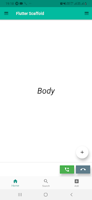
The Scaffold is good enough to create a simple mobile application design. It contains an app bar, floating button, drawer, background color, bottom navigation bar, footer buttons and the body that needs to create a functional and responsive app.
Let’s explore them individually.
here, you can see the complete code snippet of Scaffold and its properties:
So, this was all about all properties of the Scaffold which just gives us an overview of Scaffold. The purpose of this post was to get your familiar with different properties and their usage to create a material theme for Flutter application.
- A theme for the application.
- App Bar.
- Body.
- Floating Action Button.
- Bottom Navigation Bar.
In this post, you'll get the basic knowledge of the Scaffold. A Scaffold Widget provides a framework to implement the basic material design layout structure for a Flutter application. You can implement a wide range of widgets using Scaffold as the parent Widget. Have a look at the constructor and the properties of Scaffold Widget:
const Scaffold({
  Key key,
  this.appBar,
  this.body,
  this.floatingActionButton,
  this.floatingActionButtonLocation,
  this.floatingActionButtonAnimator,
  this.persistentFooterButtons,
  this.drawer,
  this.endDrawer,
  this.bottomNavigationBar,
  this.bottomSheet,
  this.backgroundColor,
  this.resizeToAvoidBottomPadding = true,
  this.primary = true,
})
The Scaffold is good enough to create a simple mobile application design. It contains an app bar, floating button, drawer, background color, bottom navigation bar, footer buttons and the body that needs to create a functional and responsive app.
Let’s explore them individually.
- appBar:- It’s one of the primary property of the Scaffold. It defines what has to be displayed at the top of the current screen. The appBar uses the AppBar widget properties through Scaffold. This AppBar widget itself has various properties like title, brightness, elevation, etc:
Widget build(BuildContext context) {
  return Scaffold(
    appBar: AppBar(
      title: Text('Flutter Scaffold'),
    ),
the title property of AppBar uses the Text widget to display the text on the app bar. You can read more posts and properties of appBar here, Search widget and Collapsing Toolbar.
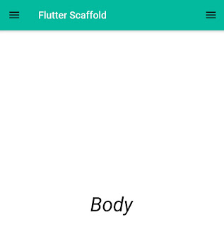
- body:- The body is a very important property of the scaffold which displays the screen components below the appBar and behind the floatingActionButton and drawer. All widgets positioned at the top-left corner in the mobile screen by default.
Widget build(BuildContext context) { return Scaffold( appBar: AppBar( title: Text('Flutter Scaffold'), ), body: Center( child: Text("Body", style: TextStyle( color: Colors.black, fontSize: 40.0, fontStyle: FontStyle.italic, ), ), ),- The body contains all widgets to design a screen in Flutter application. As you can see, we displaying a text "Body" with the help of a Text widget that is aligned at the center within the Center Widget.
- floatingActionButton:- It is a circular icon button that displayed primary action of the screen above the body in the bottom right corner of the screen.
@override Widget build(BuildContext context) { return Scaffold( appBar: AppBar( title: Text('Flutter Scaffold'), ), body: Center( child: Text( "Body", style: TextStyle( color: Colors.black, fontSize: 40.0, fontStyle: FontStyle.italic, ), ), ), floatingActionButton: FloatingActionButton( elevation: 10.0, child: Icon(Icons.add), onPressed: (){ print('I am Floating button'); } ), ); }- The elevation property is used to display shadow to the button.
- Icon widget is used to give an icon to the FloatingActionButton.
- The onPressed property provides a callback that is invoked when the button is tapped.
- floatingActionButtonLocation:- The floatingActionButton is displayed at the bottom right corner of the screen by default. The floatingActionButtonLocation defines the position of the floatingActionButton using the predefined properties that can change the position of floatinfActionButton.
- centerDocked
floatingActionButtonLocation: FloatingActionButtonLocation.centerDocked,
- centerFloat
floatingActionButtonLocation: FloatingActionButtonLocation.centerFloat,
- endDocked
floatingActionButtonLocation: FloatingActionButtonLocation.endDocked,
- endFloat
floatingActionButtonLocation: FloatingActionButtonLocation.endFloat,
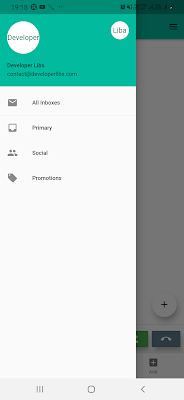
- drawer:- A drawer is a side menu that is used to display the important links in the application. You can open it either by sliding from left or right and clicking its icon in the ActionBar. You can use a simple example of a drawer: Flutter - Tab bar controller and left drawer.
drawer: Drawer(
  elevation: 16.0,
  child: Column(
    children: <Widget>[
      UserAccountsDrawerHeader(
        accountName: Text("Developer Libs"),
        accountEmail: Text("contact@developerlibs.com"),
        currentAccountPicture: CircleAvatar(
          backgroundColor: Colors.white,
          child: Text("Developer"),
        ),
        otherAccountsPictures: <Widget>[
          CircleAvatar(
            backgroundColor: Colors.white,
            child: Text("Libs"),
          )
        ],
      ),
      ListTile(
        title: new Text("All Inboxes"),
        leading: new Icon(Icons.mail),
      ),
      Divider(
        height: 0.1,
      ),
      ListTile(
        title: new Text("Primary"),
        leading: new Icon(Icons.inbox),
      ),
      ListTile(
        title: new Text("Social"),
        leading: new Icon(Icons.people),
      ),
      ListTile(
        title: new Text("Promotions"),
        leading: new Icon(Icons.local_offer),
      )
    ],
  ),
),
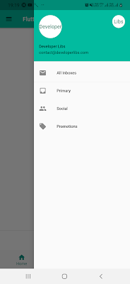
- endDrawer:-
An endDrawer is a drawer property but the drawer is displayed at the right side of the screen.
- persistentFooterButtons:- It can display a list of buttons at the bottom of the screen. These buttons are persistently visible, even if the widgets of body scroll.
persistentFooterButtons: <Widget>[
  RaisedButton(
    elevation: 10.0,
    onPressed: () {},
    color: Colors.green,
    child: Icon(
      Icons.add,
      color: Colors.white,
    ),
  ),
  RaisedButton(
    elevation: 10.0,
    onPressed: () {},
    color: Colors.blueGrey,
    child: Icon(
      Icons.clear,
      color: Colors.white,
    ),
  ),
],
- bottomNavigationBar:- is used to display a bottom navigation bar at the bottom of the scaffold. It is displayed below the persistentFooterButtons and the body param widgets.
bottomNavigationBar: BottomNavigationBar(
  currentIndex: 0,
  fixedColor: Colors.teal,
  items: [
    BottomNavigationBarItem(
      title: Text("Home"),
      icon: Icon(Icons.home),
    ),
    BottomNavigationBarItem(
      title: Text("Search"),
      icon: Icon(Icons.search),
    ),
    BottomNavigationBarItem(
      title: Text("Add"),
      icon: Icon(Icons.add_box),
    ),
  ],
  onTap: (int index){
    setState(() {
      _currentIndex = index;
    });
  },
),
It can have more than one item like text, icons or a combination of both widgets.
- primary:- If true then the height of the appBar will be extended by the height of the screen’s status bar. The default value of this property is true.
- backgroundColor:- This property sets the background color of the scaffold.
backgroundColor: Colors.white,
- resizeToAvoidBottomInset:- If you make this property true, the body and the scaffold’s floating widgets will resize themselves to avoid the onscreen keyboard.
here, you can see the complete code snippet of Scaffold and its properties:
import 'package:flutter/material.dart';

void main() => runApp(MyApp());

class MyApp extends StatelessWidget {
  @override
  Widget build(BuildContext context) {
    return MaterialApp(
      title: 'Flutter Demo',
      debugShowCheckedModeBanner: false,
      theme:  ThemeData(
        primaryColor: const Color(0xFF02BB9F),
        primaryColorDark: const Color(0xFF167F67),
        accentColor: const Color(0xFFFFFFFF),
      ),
      home: HomePage(),
    );
  }
}
class HomePage extends StatefulWidget {
  @override
  _HomePageState createState() => _HomePageState();
}

class _HomePageState extends State<HomePage> {

  @override
  Widget build(BuildContext context) {
    return Scaffold(
      appBar: AppBar(
        title: Text('Flutter Scaffold',
        style: TextStyle(color:Colors.white),),
      ),
      backgroundColor: Colors.white,

      drawer: Drawer(
        elevation: 16.0,
        child: Column(
          children: <Widget>[
            UserAccountsDrawerHeader(
              accountName: Text("Developer Libs"),
              accountEmail: Text("contact@developerlibs.com"),
              currentAccountPicture: CircleAvatar(
                backgroundColor: Colors.white,
                child: Text("Developer"),
              ),
              otherAccountsPictures: <Widget>[
                CircleAvatar(
                  backgroundColor: Colors.white,
                  child: Text("Liba"),
                )
              ],
            ),
            ListTile(
              title: new Text("All Inboxes"),
              leading: new Icon(Icons.mail),
            ),
            Divider(
              height: 0.1,
            ),
            ListTile(
              title: new Text("Primary"),
              leading: new Icon(Icons.inbox),
            ),
            ListTile(
              title: new Text("Social"),
              leading: new Icon(Icons.people),
            ),
            ListTile(
              title: new Text("Promotions"),
              leading: new Icon(Icons.local_offer),
            )
          ],
        ),
      ),

      endDrawer: Drawer(
        elevation: 16.0,
        child: Column(
          children: <Widget>[
            UserAccountsDrawerHeader(
              accountName: Text("Developer Libs"),
              accountEmail: Text("contact@developerlibs.com"),
              currentAccountPicture: CircleAvatar(
                backgroundColor: Colors.white,
                child: Text("Developer"),
              ),
              otherAccountsPictures: <Widget>[
                CircleAvatar(
                  backgroundColor: Colors.white,
                  child: Text("Libs"),
                )
              ],
            ),
            ListTile(
              title: new Text("All Inboxes"),
              leading: new Icon(Icons.mail),
            ),
            Divider(
              height: 0.1,
            ),
            ListTile(
              title: new Text("Primary"),
              leading: new Icon(Icons.inbox),
            ),
            ListTile(
              title: new Text("Social"),
              leading: new Icon(Icons.people),
            ),
            ListTile(
              title: new Text("Promotions"),
              leading: new Icon(Icons.local_offer),
            )
          ],
        ),
      ),

      body: Center(
        child: Text(
          "Body",
          style: TextStyle(
            color: Colors.black,
            fontSize: 40.0,
            fontStyle: FontStyle.italic,
          ),
        ),
      ),

      //floatingActionButton
      floatingActionButton: FloatingActionButton(
          elevation: 10.0,
          child: Icon(Icons.add),
          onPressed: (){
            print('Floating button');
          }
      ),


      //floatingActionButtonLocation
      floatingActionButtonLocation: FloatingActionButtonLocation.endFloat,


      //persistentFooterButtons
      persistentFooterButtons: <Widget>[
        RaisedButton(
          elevation: 10.0,
          onPressed: () {},
          color: Colors.green,
          child: Icon(
            Icons.add_call,
            color: Colors.white,
          ),
        ),
        RaisedButton(
          elevation: 10.0,
          onPressed: () {},
          color: Colors.blueGrey,
          child: Icon(
            Icons.call_end,
            color: Colors.white,
          ),
        ),
      ],


      //bottomNavigationBar
      bottomNavigationBar: new BottomNavigationBar(
        currentIndex: 0,
        fixedColor: Colors.teal,
        items: [
          BottomNavigationBarItem(
            title: Text("Home"),
            icon: Icon(Icons.home),
          ),
          BottomNavigationBarItem(
            title: Text("Search"),
            icon: Icon(Icons.search),
          ),
          BottomNavigationBarItem(
            title: Text("Add"),
            icon: Icon(Icons.add_box),
          ),
        ],
        onTap: (int index){
          setState(() {

          });
        },
      ),
    );
  }
}
So, this was all about all properties of the Scaffold which just gives us an overview of Scaffold. The purpose of this post was to get your familiar with different properties and their usage to create a material theme for Flutter application.


