Whenever we start designing a login and sign-up form of any application. We always need an input field to take input from end users that are a primary way for them.
In Flutter, we have a TextField widget to take input from the end users. A text field lets the user enter text, either with a hardware keyboard or with an on-screen keyboard. It is defined as a stateful widget in the framework. It's having many important properties that can be set to customize the behavior.
In this post, we going to see some important properties of TextField that'll help you to understand TextField widget behavior. Let's start it some basic properties.
1. We can define the input field in the flutter widget hierarchy by using TextField(). As we have used:
it'll look like below:
2. How can get entered text from a TextField?
In Flutter, we have various option to get entered text from Textfield.
3. How can work with the focus of TextField?
You have to tap on TextField if you want to enter some text into Textfield. Here, we have some properties that make Textfield focus easy.
We create a button and two focus nodes to attach them to the TextFields. When the button is pressed, we use FocusScope to request focus to the next TextField.
4. How can customize device keyboard for Textfield?
Flutter framework allows us to customize the keyboard of the device according to requirement.
In Flutter, we have a TextField widget to take input from the end users. A text field lets the user enter text, either with a hardware keyboard or with an on-screen keyboard. It is defined as a stateful widget in the framework. It's having many important properties that can be set to customize the behavior.
In this post, we going to see some important properties of TextField that'll help you to understand TextField widget behavior. Let's start it some basic properties.
1. We can define the input field in the flutter widget hierarchy by using TextField(). As we have used:
2. How can get entered text from a TextField?
In Flutter, we have various option to get entered text from Textfield.
- The easiest way to get entered value is to use the onChanged method and store the current value in a global variable. Here, you can see the sample code for it.
- We can use a TextEditingController as well for get entered text. The controller is attached to the TextField and lets us listen and control the text of the TextField.
3. How can work with the focus of TextField?
You have to tap on TextField if you want to enter some text into Textfield. Here, we have some properties that make Textfield focus easy.
- We can use autofocus to make Textfield auto active when the widget is created. It'll automatically open keyboard when we make autofocus true.
- We can define a custom focus for Textfield that works on demand. We can forcefully make any Textfield active with the help of FocusNode(). As you can see, we have attached a FocusNode to the TextField and use it to switch the focus on another Textfield.
We create a button and two focus nodes to attach them to the TextFields. When the button is pressed, we use FocusScope to request focus to the next TextField.
4. How can customize device keyboard for Textfield?
Flutter framework allows us to customize the keyboard of the device according to requirement.
- Change Keyboard Type: The TextField allows us to customize the type of keyboard that shows up when the TextField is brought into focus. We can change the keyboard type property for this.
2. TextInputType.emailAddress: It'll show normal keyboard with a extra special charactor @.
3. TextInputType.datetime: It'll display numerical keyboard with a '/' and ':' special charactor.
4. TextInputType.numberWithOptions: It'll display numerical keyboard with options to enabled signed and decimal mode.
5. TextInputType.multiline: It'll display optimises for multi-line information.
3. TextInputType.datetime: It'll display numerical keyboard with a '/' and ':' special charactor.
4. TextInputType.numberWithOptions: It'll display numerical keyboard with options to enabled signed and decimal mode.
5. TextInputType.multiline: It'll display optimises for multi-line information.
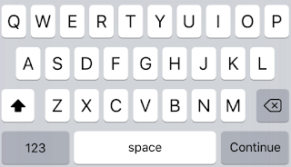
- Change TextInputAction: Some time we need to send and done button on the keyboard. The TextField provide us various option to perform such kind operations. like we have a continue button:
The above code snippet will display Continue and Send button on the keyboard:
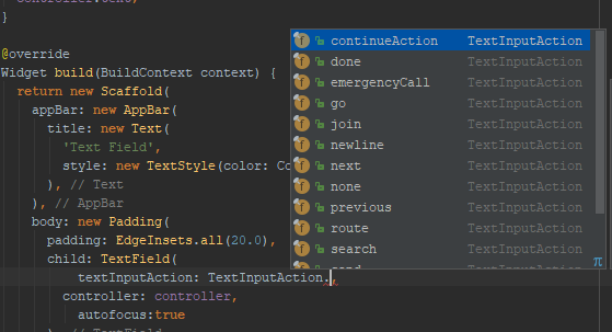
- It providing us more options as you can see below:
7. Text Capitalization: The TextField provides a few options for capitalizing letters that entered from the user. Such as:
- TextCapitalization.sentences: This is the normal type of capitalization. It'll make the first letter of every sentence being capitalized.
- TextCapitalization.characters: It'll make capitalizes all characters in the sentences.
- TextCapitalization.word: It'll make capitalizes the first letter of each word.
8. You can align a text inside of TextField by using TextAlign parameter. It adjusts the cursor inside the TextField.
It having properties: start, end, left, right, center, justify.
9. We have TextStyle parameter to change font and color of text inside Textfield.
10. Change cursor of TextField: In Flutter, we can change cursor directly. It's allowing us to change the cursor color, width, and radius of the corners. For example, here I make a circular green cursor for no apparent reason.
11. Set size and maximum length: TextFields can control the maximum number of characters written inside it and the maximum number of lines.
By setting the maxLength property, a maximum length is enforced and a counter is added by default to the TextField.
12. Obscuring Text: We can use it for password field by making obscureText to true.
13. Expandable TextField: Sometimes, we need a TextField that expands when one line is finished. In Flutter it is slightly odd (yet easy) to do. To do this, we set maxLines to null, which is 1 by default. Setting to null is not something we’re very used to but nevertheless, it’s easy to do.
14. Decorating the TextField: To decorate the TextField, we can use decoration property which takes an InputDecoration. Let's try to quickly go over most of the important properties.
- The hint and label: It helps the user to understand the information to be entered in the TextField. The difference is that a hint disappears once the user starts typing while a label floats over the TextField. Each property like a hint, label, etc has its respective style fields. To style a hint, use a hintStyle. To style a label, use a label style.
- PrefixIcon and SuffixIcon icon. You can add icons directly to TextFields for the prefixIcon and suffixIcon. As you see, we have added a prefixIcon and SuffixIcon with change color.
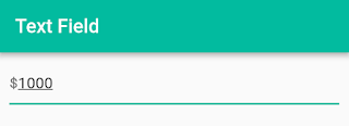
- We can use another widget instead of prefixIcon and suffixIcon. To use a generic widget instead of an icon, we have to use the prefix field. As we have set a default $ for entering value into TextField.
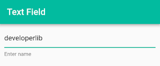
- If you don't want to use hintText and labelText. Then you can use helperText. It will display bottom of TextField as you can see below:
- You can remove default underline on a TextField by set decoration: null or InputDecoration.collapsed.
- With the help of border param of InputDecoration, you can display a border around of TextField.
There are lots of decoration properties that we can use to decorating Textfield. But in this post, we share some common use-cases that makes it clear to understand how easy it is to customize TextField.
If you have some more important properties and facing any issue. You can share with us via comment section below.
If you have some more important properties and facing any issue. You can share with us via comment section below.


